
SPECTRUM
CAPABILITIES:
BRAND
CREATIVE
DESIGN
CREATIVE
DESIGN
Services:
Strategy
branding
Digital
branding
Digital
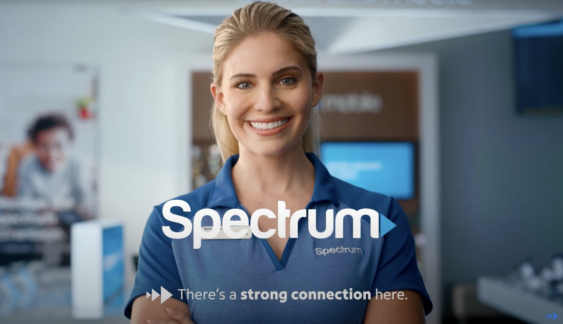
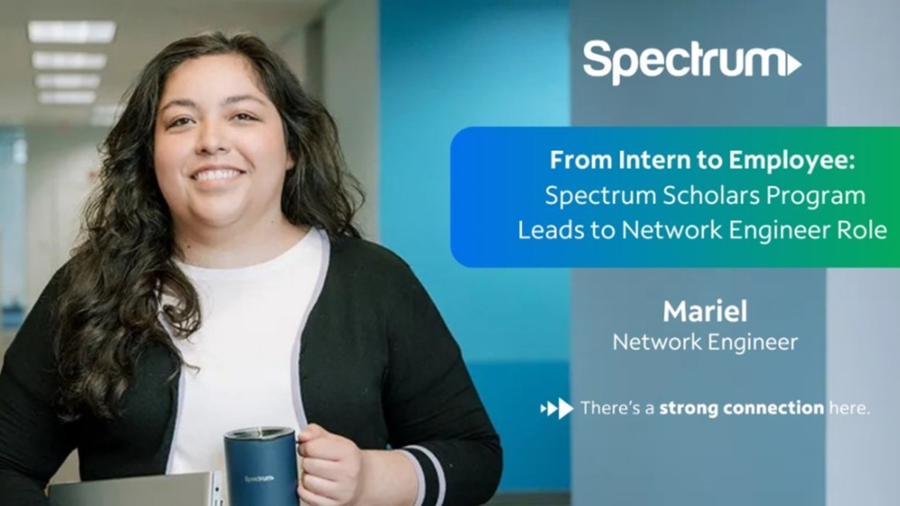
Spectrum, owned and operated by Charter Communications, had an interesting brand challenge - they were known as the Spectrum brand but Charter is the company writing the checks.
In working with their Marketing HR teams, we captured what truly makes them an awesome organization (value proposition design) and helping clearly articulate and express it to consumers, candidates and colleagues through a more comprehensive brand system, guidelines and rally cry: there's a strong connection here.


.png)

AT THE SPEED OF CULTURE
MODERN CONNECTIVITY
FUTURE-FORWARD MEETS HUMAN-CENTRIC
Powered BY THE PEOPLE
IDEAS SO STRONG THEY SCALE THEMSELVES


MAKE
THE
SWITCH
Let's build something bold, strategic,
and unapologetically good.